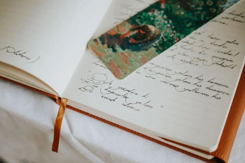
Ink, Paper, and the Inner You: What Your Journal's Look Is Quietly Communicating
Stand in the stationery aisle at any Barnes & Noble or scroll through the journaling section on Etsy for about ten minutes, and you'll quickly realize: choosing a journal is weirdly personal. You're not just picking a place to write. You're picking an object that's going to hold your inner life. And something in you takes that seriously, even if you don't consciously register it.
The texture of the paper. The weight of the cover. Whether you reach for a fine-tip black pen or a set of colored felt-tips. Whether you decorate your pages with washi tape and watercolor swatches or keep everything spare and unadorned. These aren't arbitrary preferences. They're a kind of self-portrait, painted in stationery choices.
The Psychology Behind Aesthetic Preference
Research in environmental and sensory psychology has long established that the objects we surround ourselves with — their colors, textures, and forms — both reflect and influence our emotional states. We don't just choose things that match our mood; we also use those things to regulate and express moods we might not have words for yet.
Journaling sits at a particularly interesting intersection of this dynamic. Because the journal is private — or at least intended to be — the aesthetic choices you make for it are less about performance for others and more about what you genuinely need. There's no social audience pressuring you toward a certain look. What you reach for is usually what resonates with something real inside you.
So what does your current journal setup actually say?
Dark Covers and Minimalist Pages
If you're drawn to black or deep-toned covers, clean lines, and minimal decoration — maybe a single ribbon bookmark, unlined or dotted pages, nothing fussy — there's often something clarifying happening internally. This aesthetic tends to show up when people are in a period of serious focus, emotional processing, or deliberate simplification.
It's not about being cold or closed off. It's about wanting the container to get out of the way so the content can breathe. People going through major life transitions — career pivots, geographic moves, the end of a long relationship — often gravitate toward this kind of stripped-back aesthetic. The visual simplicity is doing some of the emotional work: I'm clearing space. I need room to think.
Black ink on white or cream paper is the visual equivalent of taking a deep breath before you speak.
Bright Colors and Layered Decoration
On the other end of the spectrum, journals that are covered in stickers, layered with washi tape borders, splashed with watercolor backgrounds, and written in rotating ink colors tell a different story. This aesthetic — often associated with the bullet journaling and journaling communities on TikTok and Instagram — is frequently dismissed as superficial. It's not.
Highly decorated pages often signal an emotional state that's rich, a little chaotic, and searching for beauty as a coping mechanism. When life feels complicated or overwhelming, creating something visually organized and intentionally lovely is a genuine act of self-care. You're imposing a kind of gentle order on the page because the rest of the world doesn't feel orderly right now.
There's also a celebratory quality to this aesthetic — a sense that the inner life is worth adorning, worth treating as something precious. People who journal this way often have a high need for creative expression and tend to experience their emotions vividly. The decorated page is the outer expression of an inner life that's running full.
Soft Neutrals and Botanical Details
The pastel linen cover. The sage green ink. The pressed flower tucked between pages. The handwritten headers in a delicate script. This particular aesthetic — soft, nature-adjacent, quietly romantic — has surged in popularity over the last several years, and it's worth thinking about why.
This look often surfaces during periods of gentle recovery or intentional slowdown. After burnout, after loss, after a season of too much noise, people tend to reach for aesthetics that feel safe and nourishing. Soft colors are literally less stimulating to the nervous system. Natural textures — linen, cotton paper, wood — ground us in the physical world in a comforting way.
If your journals have been trending toward this palette lately, it might be worth asking what you're recovering from — and giving yourself credit for knowing, instinctively, what you needed.
The Ink Color Question
This one deserves its own moment. The color of ink you choose says something surprisingly specific.
People who write exclusively in black tend to value clarity and permanence. There's a no-nonsense quality to it — this is what I think, this is what happened, full stop. Blue ink (the classic) signals a kind of comfortable familiarity, a connection to the schoolroom tradition of writing as something earnest and ordinary.
But the people who rotate through ink colors — deep plum for melancholy entries, burnt orange for energized ones, forest green for the contemplative mornings — are doing something more intuitive. They're color-coding their emotional states without necessarily naming them. The color becomes part of the language. When you flip back through those pages later, you can almost read the mood before you read the words.
If you've never tried writing in a color that matches how you're feeling rather than defaulting to black, it's worth experimenting. The choice might surprise you.
What Happens When the Aesthetic Shifts
One of the most telling things you can notice about your journaling practice is when your aesthetic preferences change. If you've been a minimalist journaler for years and suddenly you find yourself buying stickers and testing out watercolor washes, something has shifted. Maybe you're loosening up. Maybe you're giving yourself permission to be more playful. Maybe you're emerging from a period of contraction.
The reverse is equally telling. If you were a vibrant, decorative journaler and you find yourself wanting clean pages and simple pens, you might be entering a season of consolidation — pulling inward, getting serious about something, clearing the decks.
Your journal's aesthetic is not fixed. It's a living record of your inner weather. And paying attention to how it shifts over time is one of the more underrated forms of self-reflection available to you.
The Journal That Feels Like You
Ultimately, the best journal setup isn't the most beautiful one or the most organized one. It's the one that makes you want to open it. The one that feels like yours in a way that's hard to articulate but immediately recognizable.
That feeling of rightness — the way a particular cover or paper weight or pen just clicks — isn't accidental. It's your inner world recognizing itself in an object. And that recognition is worth paying attention to.
The next time you're standing in that stationery aisle, take a breath before you reach. Notice what draws you. Notice what you're avoiding. The journal you choose is already saying something. All you have to do is listen.